Vienna Symphonic Library Forum
Forum Statistics

194,610 users have contributed to 42,925 threads and 257,982 posts.

In the past 24 hours, we have 3 new thread(s), 9 new post(s) and 118 new user(s).

  • Hi Pixelpoet1985,

    When I want to move an instrument close to the microphones I temporary place the Microphone in an other place. Like change from conductor to third row or balcony. Chang the instrument position and place the microphone back. Works for me.


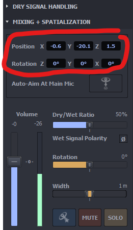
  • That's one possibility - you might lose the Mic's position- and rotation-offsets like that, though. I suggest to type in values for those cases where the Icon gets too close too a mic to make sense:

    Image


    /Dietz - Vienna Symphonic Library
  • last edited
    last edited

    Hi,

    Really enjoying using MIR Pro 3D here. 😃

    A couple of ideas I had were brighter labels for selected instruments and more visible magic eye MIDI activity. And a 'Hide' function that hides all instruments within a certain proximity to the selected instrument. As selecting those tiny little squares can get very tricky. Also, a global 'Hide Stereo Width' would be nice. It would definitely clean up a cluttered stage. I know I should use the small UI more but it kind of takes the joy out of using MIR TBH.


  •  

    Thank you for the kind feedback and for your suggestions! Some of them might indeed make sense, but I don't really understand what you mean by "brighter labels for selected instruments". Doesn't a selected Icon look like this to you ...? (s. attachment)

    Image


    /Dietz - Vienna Symphonic Library
  • last edited
    last edited

    😮 What venue is that?!!!

    @Dietz said:

     Doesn't a selected Icon look like this to you ...? (s. attachment)

    Yes it does. But on a stage with Dimension Strings, all the VI woods, brass, percussion and choirs, and combined with my tendency to select lighter colours, it is quite hard to see. Also, The label of the selected instrument does not get priority over the surrounding instruments. It is often obscured by other labels.


  • last edited
    last edited

    @Dietz said:

    Doesn't a selected Icon look like this to you ...? (s. attachment)

    Yes it does. But on a stage with Dimension Strings, all the VI woods, brass, percussion and choirs, and combined with my tendency to select lighter colours, it is quite hard to see. Also, The label of the selected instrument does not get priority over the surrounding instruments. It is often obscured by other labels.

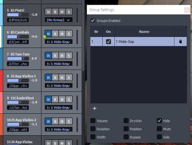
    I see. In that case I suggest to Ctrl-click the "H"ide-button of the selected Icon in the "Instruments" panel (which can be detached from the main GUI, BTW). This will hide all Icons except the selected one. Use Alt additionally when you want to keep a bunch of selected Icons visible. ... and don't forget that there are now "Groups" in MIR 3D which allow for the linking of selected parameters only, e.g. "Hide":
    /Dietz - Vienna Symphonic Library
  • last edited
    last edited

    @Dietz said:

    I see. In that case I suggest to Ctrl-click the "H"ide-button.

    Thanks.

    I'm going to step out and grab a burger with some salsa now.


  • Wow! no bites? (pun intended)

    Salsa_Burger......... Anyone?

    Spoiler? Anyone?


  • Just a wee bit of patience, please ... ;-)


    /Dietz - Vienna Symphonic Library
  • last edited
    last edited

    /Dietz - Vienna Symphonic Library