While I really enjoy the new MIR Pro, I find it very difficult to work with sometimes.
Here are some new thoughts and ideas:
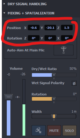
- Especially positioning instruments near the microphones is difficult. I always select the microphone and move it unintentionally. Is there a way to lock the position? I think in the old MIR Pro the instrument icons appeared above the microphones, but can't remember.
- I also don't know where the center of the venue is ... is it clear what I mean? It's always moving. Maybe you could implement a feature to bring back a quasi 2D view, or a button to bring the viewpoint back to the center? Maybe I'm overlooking something.
- The last one I already wrote to the support team some time ago. I mainly use the Synchron Stage venue and it's a bit “boring”, especially in 3D view it doesn't offer much. The older 2D textures/illustrations looked nicer to me. Maybe you could integrate back and side walls with lamps and wainscoting. ;)

