Dear VSL-Team,
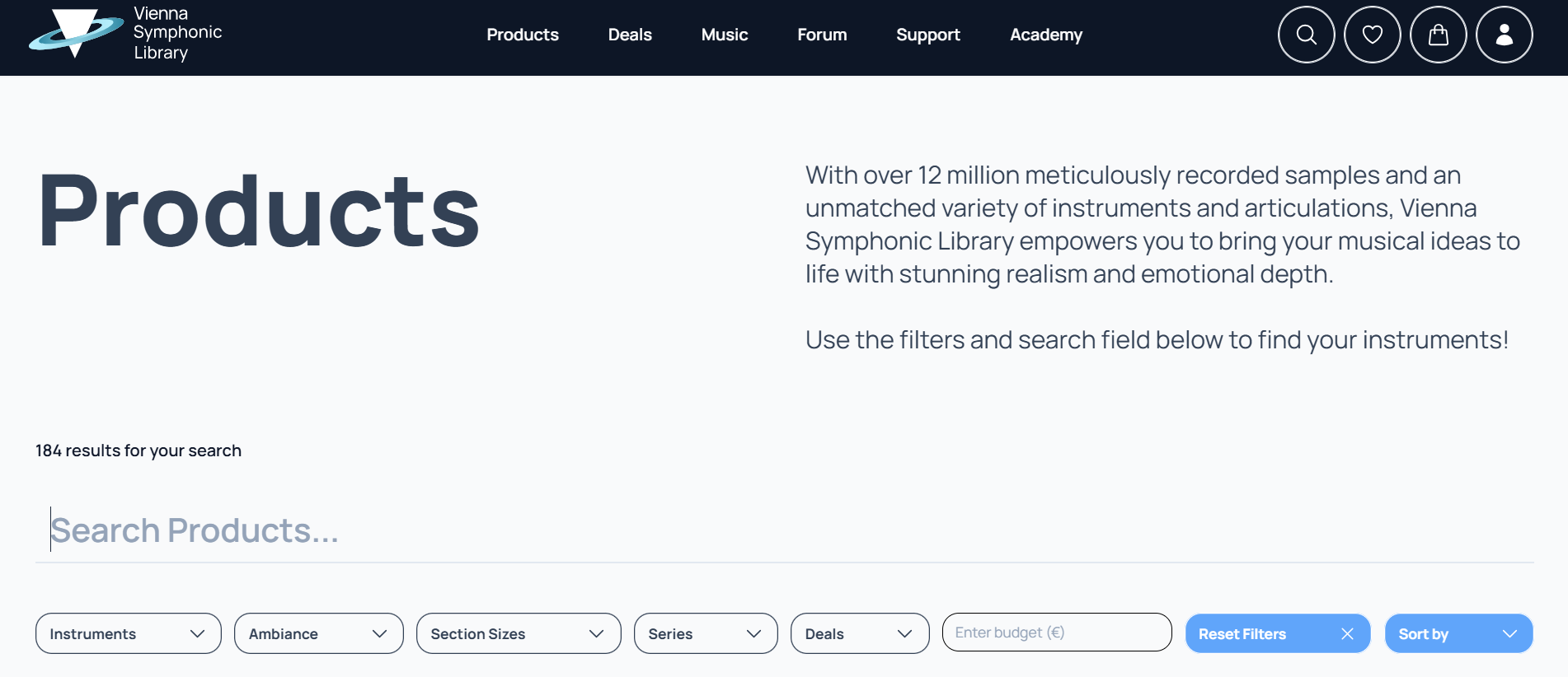
I have to admit I am still shocked about the new look of the website. Of course there are good new functions and features, but the look is ugly, irritating, very cheap, very similar to other similar sites of Spitfire etc.
The old one was very attractive with high-class photographies, defining clearly what to expect, it was "edel", worthy, the expression was: this is the best you can get, a great symbol for the highclass-content and quality of the libraries, and you could easily see and get to know the different instruments and libraries with one look.
Now you have to search for things and you have to know already what's inside because the icon doesn't tell enough.
I guess, it will be hard to get a lot of new clients now, because VSL is optically no longer in the elite-class, it is now in exchangeable area, not attractive on first sight, not looking professional. So lots of people who are not clients yet will underestimate VSL.
So in my opinion it's a huge step back and VSL has lost its unique selling point.
As always, time will tell - but after it will have I can always say: I told it before time...
Hoping for a re-launch to quality again,
Yours, Heiko
PS: Of course you will not lose me as a client... but even for me it's more complicated now to check prices, articulations, bundle contents, crossgrade.options etc. All that was much easier on the old page with Tree-views and quick-overview-structures.

