Hello VSL Team,
I really like the interface of the new Vienna Assistant a lot, even if some of its improvements might require some getting use to. But...
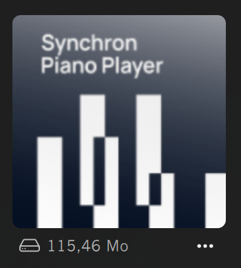
Please take this as positive criticism, but the new icons seem a bit blurry, fuzzy or out of focus (choose whichever term you prefer).
If you look closely, you can see that the text and the rectangles on the icon are a lot less crisp than the items below the icon. It might be a small detail, but I personally find it very annoying to look at. It might be just me, but just in case others might feel the same.
Thanks !

