Vienna Symphonic Library Forum
Forum Statistics

198,207 users have contributed to 43,103 threads and 258,734 posts.

In the past 24 hours, we have 2 new thread(s), 5 new post(s) and 59 new user(s).

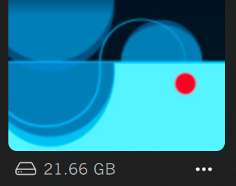
  • New design with version 1.2.461 - icons are less distinct and attractive

    Dear VSL-Team:

    With the new design the icons for different pianos are way too abstrack. Until the update, the user could easily identify the differnt piano models by the photograph. Now the user has to read the names. This is huge step down.

    Furthermore the separation of the stage A an stage B models to different sub menues appears artificial. The overwiev is gone.

    The same problems apply to the new design of the web page. The user experience of the presentation of the products appears much more abstract an less attractive to me.

    Please change the icons to mitigate those problems. Please also consider changing the grouping of the piano models.

    Best wishes!

  • This post is deleted!

  • Totally agree with everything Otogai posted. It looks like a mess of contemporary trending images for a new soap commercial. Images are often designed to inform, not leave you trying to figure it out. I'm disappointed.

    This is an image promoting paint pots. Right?


  • I agree with the icons.

    But I very much like to see which venue the instruments are recorded on. It always bugged me that some pianos are acoustically not in the same room as the others. Now that's at least more transparent.