Hi,
Thanks for the kind feedback!
Can you please check if renaming your forum name works? 😁
- Wishlist items can only be removed on the product page now (see below).
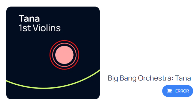
- That error is probably a calculation thing, we will look into it.
All other bugs in MyVSL will be fixed in the next days, I'm sure!

@222205 said:
Hello,
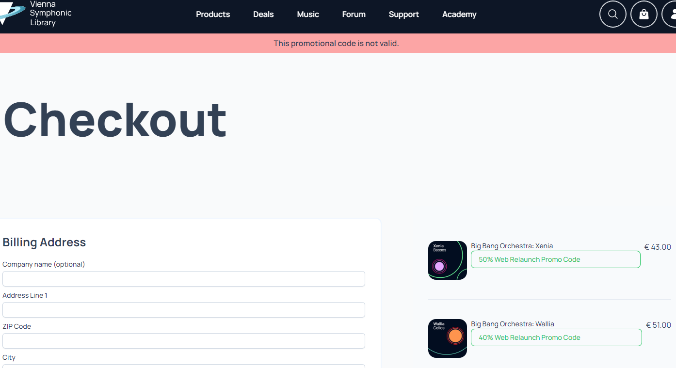
Thanks Paul, the new codes are working, Thank you for your product, the quality of your works and It is always a pleasure to by new libraries from VSL 😊
Regarding the new site,I have seen 3 minor issues not impacting my order but still existing:
- Unable to save the billing adress in Myvsl -> Billing Address (Edit)
- unable to find how to remove items from the Wishlist once it is purchased
- Some article in my Wishlist have an error button (see below)
I hope this feedback will help you improve the new site.
