Vienna Symphonic Library Forum
Forum Statistics

194,072 users have contributed to 42,911 threads and 257,913 posts.

In the past 24 hours, we have 6 new thread(s), 21 new post(s) and 84 new user(s).

  • @158500 said:

    Thank you for your daily support!


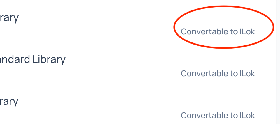
    I cannot click on “Convertable to ILok” on the new website.


    Or is there a “DEPOSIT” button on the new website?

    Currently a bug is preventing you from depositing. This should be fixed within the next days.

    I have manually converted your licenses so you don't have to wait. Make sure to run the latest version of the iLok Manager an dyou should see the licenses in your iLok account!


    Ben@VSL | IT & Product Specialist
  • Hello Paul,

    Congrats on new website - looks great.

    I am hoping to purchase Vienna Ensemble Pro with additional licence and ilok (with discount). While I can add the main software, I can't seem to find anywhere where to add additional licences - can I kindly ask for your help with this? Should I be buying ilok somewhere else?

    I'm looking forward to joining the family of VSL product owners!

    Kind regards,

    Jakub


  • Hello again Paul,

    Apologies, I figured out what to do: just needed to add another VEP7 to the basket for another licence, silly me.

    J


  • Hello Paul,

    On iLOK my synchronized licences continue as that name, not Studio - do I have to do anything to change them? Is it necessary for the licences to be recognized when loading in the Synchron PLayer?

    Thanks.


  • Hi Oceanview,

    Are you on the latest iLok License Manager?
    In any case, the license name doesn't make a difference.


    Paul Kopf Product Manager VSL
  • Can't see which libraries are missing if I upgrade / purchase a bundle or full library

    The option to get my bundle price is missing or I haven't found it.

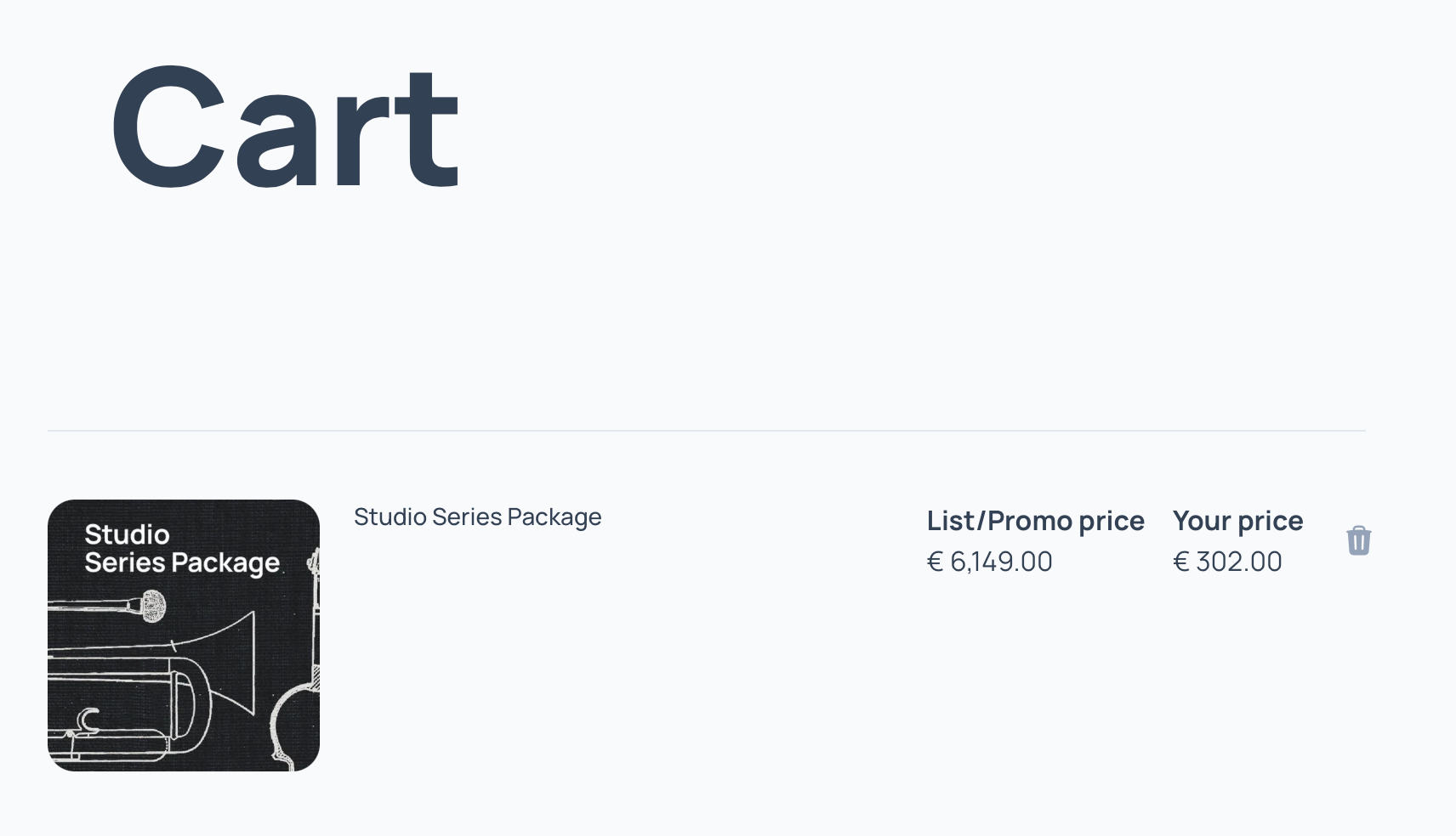
    I have to add a bundle to the cart instead and the only information I get is the remaining price.

    Previously I could see which libraries I already own and which are added / upgraded to full, with individual prices.

    Regarding the new website:

    I would be fine with it if I could display it without the icons or if they would not be DUPLO™ sized (Safari on Mac). In my opinion they add little to the text info below them. My index digit already hurts from vertical scrolling. If I zoom out the icons don't get shorter, just narrower, and of course tmthe text size gets smaller. The designer probably doesn't like me.


  • Hi VSL Team,

    What happened to the Studio Special Editions PLUS? I own Vol1 and Vol2 and was waiting for a nice discount to grab the PLUS Verions, but they seem to be gone. The Screenshot at the VOL1 Page shows the PLUS Folders. I updated and reinstalled my VOL1 but it is still just VOL1.

    Is PLUS now included in VOL1? Do I get a free upgrade? Do I have to rebuy? TBH I am planing to use my 50% Code to complete my Studio Special Collection, but being nerfed for the PLUS additions would be a bummer.

    Oliver


  • Hi badibeat,

    We can always help you with specific questions: support@vsl.co.at!


    Paul Kopf Product Manager VSL
  • @Paul said:

    Hi Oceanview,


    Are you on the latest iLok License Manager?
    In any case, the license name doesn't make a difference.

    Yes, and that's good to know. Thank you.


  • last edited
    last edited

    Hello,

    I noticed that the "Music" section of the new website has lost most of the ... music.

    The only things left are Jay Bacal's "Pictures at an Exhibition" and "Movie Masterpieces". His mock-ups are fantastic, to be sure, but there were many other artists and pieces that used to be available. Many of them included tutorials and mp3s that provided hours of fun and inspiration. Have they been removed because they were made with the VI Series? If that's true, then in my opinion that's a shame. 😞

    Thank you.


  • @gdugan2 said:
    I noticed that the "Music" section of the new website has lost most of the ... music.

    We will have a new Music page in near future. Stay tuned!


    Ben@VSL | IT & Product Specialist
  • @badibeat said:

    Can't see which libraries are missing if I upgrade / purchase a bundle or full library


    The option to get my bundle price is missing or I haven't found it.


    I have to add a bundle to the cart instead and the only information I get is the remaining price.


    Previously I could see which libraries I already own and which are added / upgraded to full, with individual prices.


    Regarding the new website:


    I would be fine with it if I could display it without the icons or if they would not be DUPLO™ sized (Safari on Mac). In my opinion they add little to the text info below them. My index digit already hurts from vertical scrolling. If I zoom out the icons don't get shorter, just narrower, and of course tmthe text size gets smaller. The designer probably doesn't like me.

    Hi VSL Team,

    Okay, I was just impatient. Got the update! 😄


  • @Paul said:

    Hi badibeat,


    We can always help you with specific questions: support@vsl.co.at!

    You a bot?

    Because this highly generic answer doesn't make sense to me.

    With Black Friday looming:

    Just as an example, VSLs bundle prices differ from individual prices. They can make other discounts less relevant. However, when upgrading a bundIe there's also to consider which libraries are missing or not "full" but "standard" versions and will be upgraded as well. I like to check the effective price I have to pay, and I got this version in the old website within seconds.


  • Web designer for over 10 years now. New site looks great, 10/10.

    Always a few bugs at launch, don't sweat it! Onwards and upwards for VSL.


  • last edited
    last edited
    @Otogai said:

    Dear VSL-Team


    the new website appears to be more targeted to mobile devices with bigger icons. This is ok.


    However until the update the products have been presented with photographs of the sampled instruments. Every visitor of the website was able to recognize the essence of the product by its icon.


    Now the user has to read. The icons are no longer self-explanatory. The user experience seems more abstract. If find the presentation less attractive. I would use icons with photographs again


    The separation of the pianos of stage A and stage B into different sub menus appears artificial. The user that ist new to the product portfolio of vsl could easily miss out half of the sampled pianos.


    Best wishes!

    Ditto for me.

    I far prefer to scan intuitively and speedily through representational pictures - especially well-composed photos - rather than text.

    Moreover in VA now I have to switch to text-only, to get rid of the clutter of those large, meaningless, alienating and soulless Bauhous-style Modern-Era graphics boxes.

    Didn't we exit the Modern Era last century, preferring intuitive soul-linkage with our cultures rather than putting up with endless intellectual concepts and ideologies getting in the way?


  • Thanks for the Angelic Choir!


    Vinny 2022 Mac Studio Max 64GB/ Mac OS Sonoma/ Studio One 6/ VEP7/ Mir 3D/ Synchronized SE1/ Synchron Harp/ Studio Ophicleide and Serpent/ V Smart Orch.+ Ext./ BBO Altair/ Arturia Keylab Essential 88/Analog Lab
  • Hi everybody,

    Thanks for sharing your opinion!

    Of course we know that every change will bring mixed reactions, and we're listening closely.

    @Vinny Colletti: You're very welcome, more in the pipeline!


    Paul Kopf Product Manager VSL
  • Dear VSL-Team,

    I have to admit I am still shocked about the new look of the website. Of course there are good new functions and features, but the look is ugly, irritating, very cheap, very similar to other similar sites of Spitfire etc.

    The old one was very attractive with high-class photographies, defining clearly what to expect, it was "edel", worthy, the expression was: this is the best you can get, a great symbol for the highclass-content and quality of the libraries, and you could easily see and get to know the different instruments and libraries with one look.

    Now you have to search for things and you have to know already what's inside because the icon doesn't tell enough.
    I guess, it will be hard to get a lot of new clients now, because VSL is optically no longer in the elite-class, it is now in exchangeable area, not attractive on first sight, not looking professional. So lots of people who are not clients yet will underestimate VSL.

    So in my opinion it's a huge step back and VSL has lost its unique selling point.

    As always, time will tell - but after it will have I can always say: I told it before time...

    Hoping for a re-launch to quality again,

    Yours, Heiko

    PS: Of course you will not lose me as a client... but even for me it's more complicated now to check prices, articulations, bundle contents, crossgrade.options etc. All that was much easier on the old page with Tree-views and quick-overview-structures.


  • Hello Heiko,

    Thanks for sharing your thoughts. Maybe you've missed the search function on our new website?

    Best, Michael


  • @hjaeckel said:
    The old one was very attractive with high-class photographies, defining clearly what to expect, it was "edel", worthy, the expression was: this is the best you can get, a great symbol for the highclass-content and quality of the libraries,

    It's the same for me on an aesthetic level. The new symbols are two-dimensional in image and visual content. The style reminds me of corporate high street fast-food logoes. VSL is definitely NOT 'fast-food sampling'.