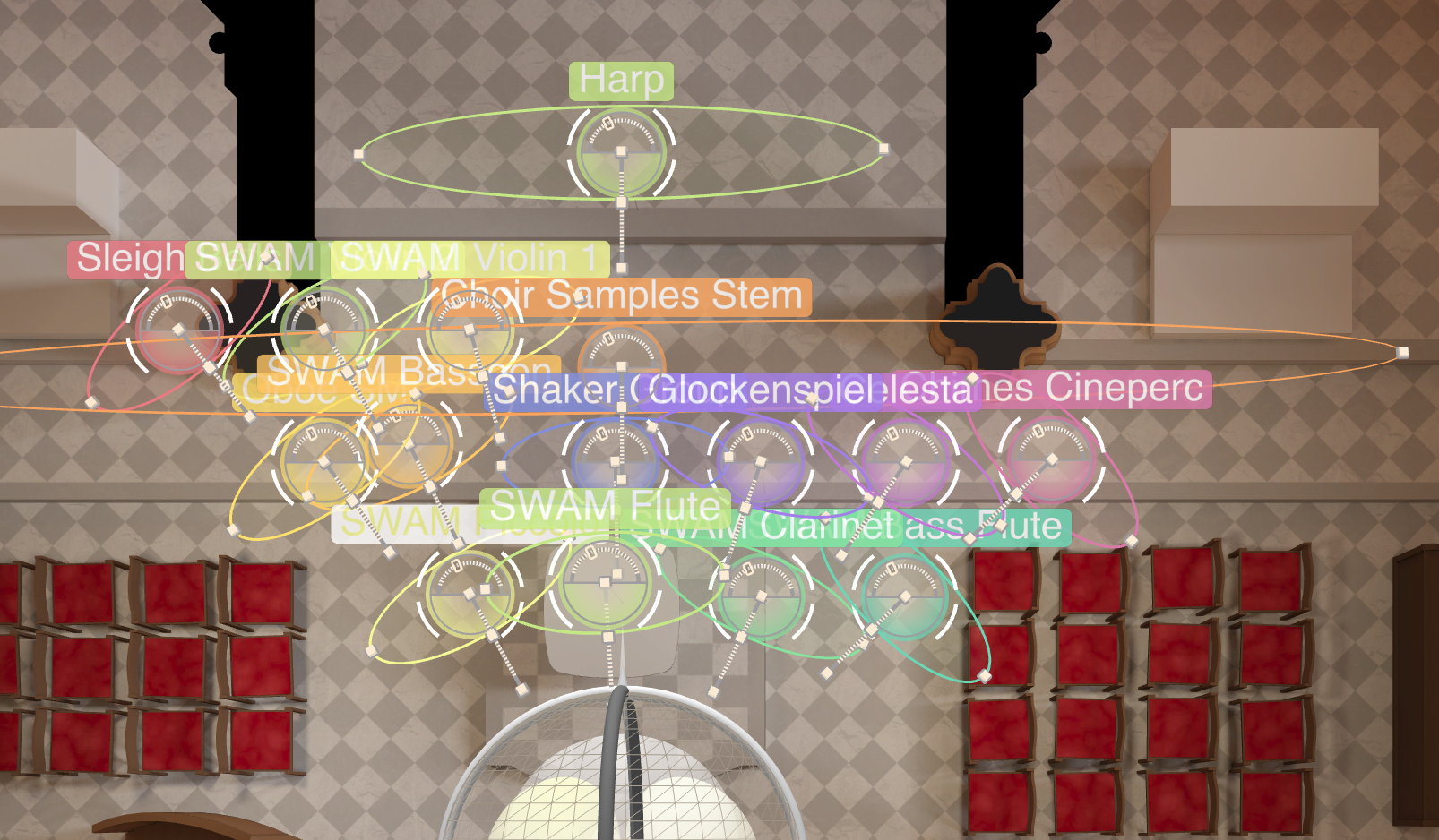
When you have quite a few MIR instruments running the icons are so big that they crowd out the GUI and you can't see what the hell is going on.
See example:
https://www.dropbox.com/s/vhgnspntp9mteth/Screenshot%202023-06-06%20at%2012.08.52.png?dl=0
I can't find an option to reduce the icon size. Does that exist somewhere?
thanks!
-
Giant Instrument Icons?
-
I find using abbreviated legends. eg Swam Flute = SFl helps with the legibility. ( Save them to a new preset ) John
-
I find using abbreviated legends. eg Swam Flute = SFl helps with the legibility. ( Save them to a new preset ) John
I guess.. but even with titles turned off those fat ovals are just too big.
-
The "Hide" option was meant to be used for cases like that. You can also use groups (either temporary "Selection Groups" or the actual Group feature) to handle different views.
The Icons also serve to keep track of the actual dimensions (especially the width) in conjunction with the optional 1 by 1 meters grid layer, so reducing the size of the Icons would interfere with one of their main functions.
Kind regards,
/Dietz - Vienna Symphonic Library -
overlapping width outlines would be ok if the circles could be optionally shrunk.
Yes I'll use hide as a workaround but it's nice seeing everything together so that you can place nearby instruments relative to each other, not do it from memory while you hide and unhide...
-
Thanks for sharing your ideas. I'll put the request on the "to be discussed" list of features, but at the moment there are no plans to leave the "1 by 1 meter" paradigm of the Venue Maps (... the diameter of the Icon's main circle is also 1 meter).
Kind regards,
/Dietz - Vienna Symphonic Library -
BTW my company Gothic Storm did a big 75-piece recording at your Synchron stage last month so as a client you have to pretend my ideas are all great now :)
