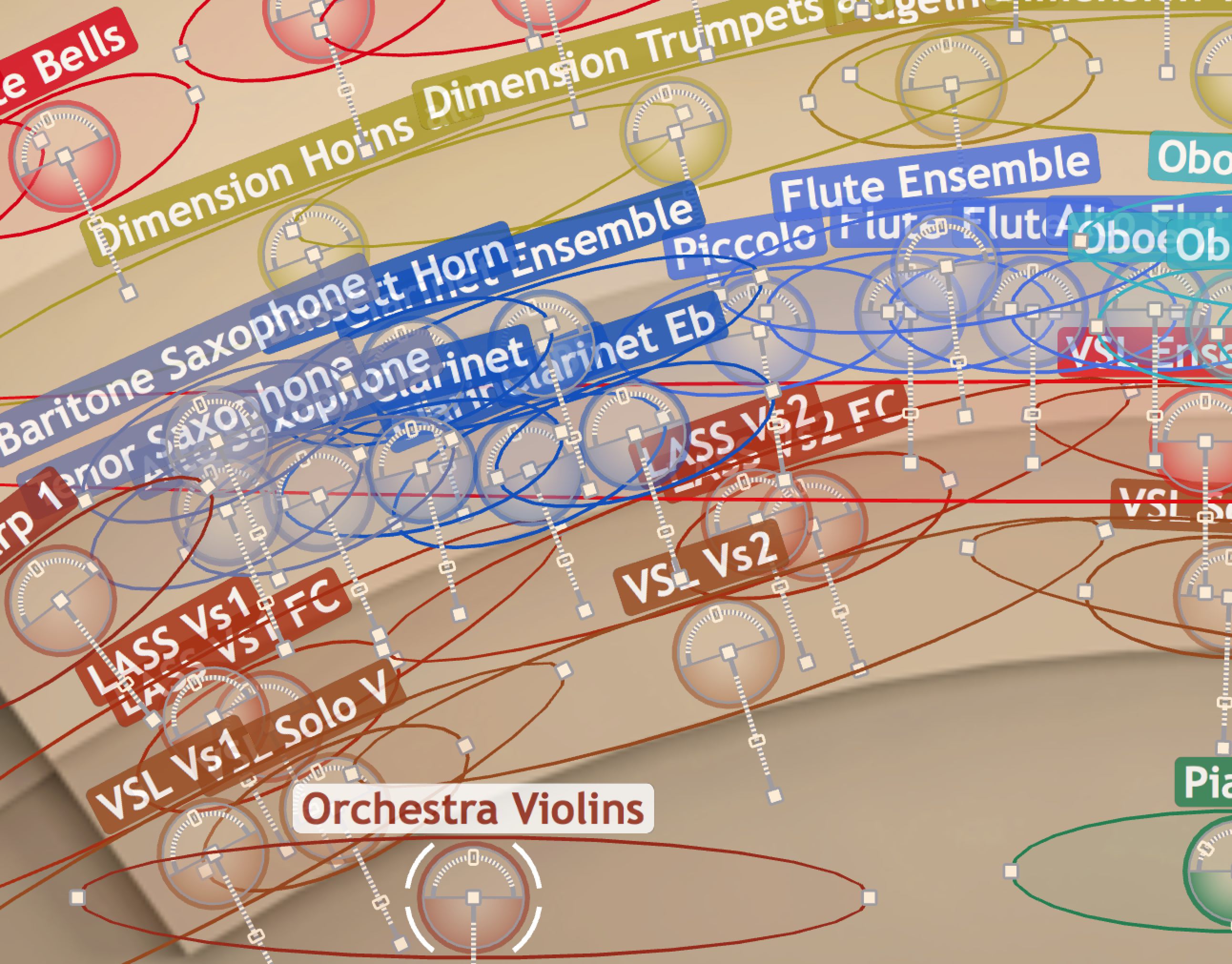
This is the single most frustrating feature, or lack thereof, that I've experienced with MIR. The ability to design a configuration of instruments in the desired positions on the stage and then define them as a group with a single icon would be lovely. The group could be as simple as a wrapper for all the settings of the enclosed intstruments. Any overlapping of groups would not be that problematic because of the size and availability of areas to select on That alone would be powerful. But... giving a MIR group the same features the instrument icon provides would provide amazing flexibility to such a group. Rotation and re-positioning of the group (be careful, some instruments in the group might fall off the stage and go mute while others remain sounding), group level, group eq...,
But back to a simple first start... just being able to define and display a group graphically on the stage would allow an effective way to adjust sections on the stage in a manageable way. I see this as a really important user experience design issue—it's an affordance the tool should provide that would make a big difference in terms of effective use of MIR for both the design and maintenance of ensemble layouts.
Imagine working in any of today's professional media authoring environments without groups—Logic, Final Cut, Photoshop, Illustrator, for instance. I just helped my daughter compose a digital collage in Photoshop the other day. She had a family of birds (mother and three little ones) that we carefully designed with different sizes, rotations, and positions in relation to each other. Then she decided she wanted the family to be somewhere else in the composition, appearing smaller and with a different overall rotation. Without Photoshop's grouping function this would have been a huge hassle, having to adjust each element individually to it's new position. We made a group out of the four birds and instead of four sets of translations, scales, and rotations—twelve operations—we had three. The point being that the power of groups is a universal affordance to include in any digital design tool.
I came up against this in a big way when building templates in MIR for the Dimension Strings as individual players. The stage becomes so cluttered with a thick forest of overlapping icons that it's very difficult to see where one section begins and another leaves off. And trying to select a particular instrument by clicking on its icon becomes an excercise in frustration. Of course one can select the instrument from channel list in the main Vienna Ensemble Pro main window, or the mixer—all good if you have the luxury of a multi-monitor display to lay out all these visual interfaces in one work-space. Working on my laptop this again becomes a nuisance, switching back and forth between windows in the interface when it would be so sweet to just click on a group and have a zoomed image of the instruments in the group laid out with icons sized so they don't overlap.
In short, I love MIR. It's one of the loveliest interfaces I've ever worked with, except for this one design omission. It negatively impacts the experience of flow, and the effectiveness flow enables, when working with complex templates.
Kenneth.
