I am really enjoying the sound of MIR Pro 3D. Especially the latest RoomPack 7.
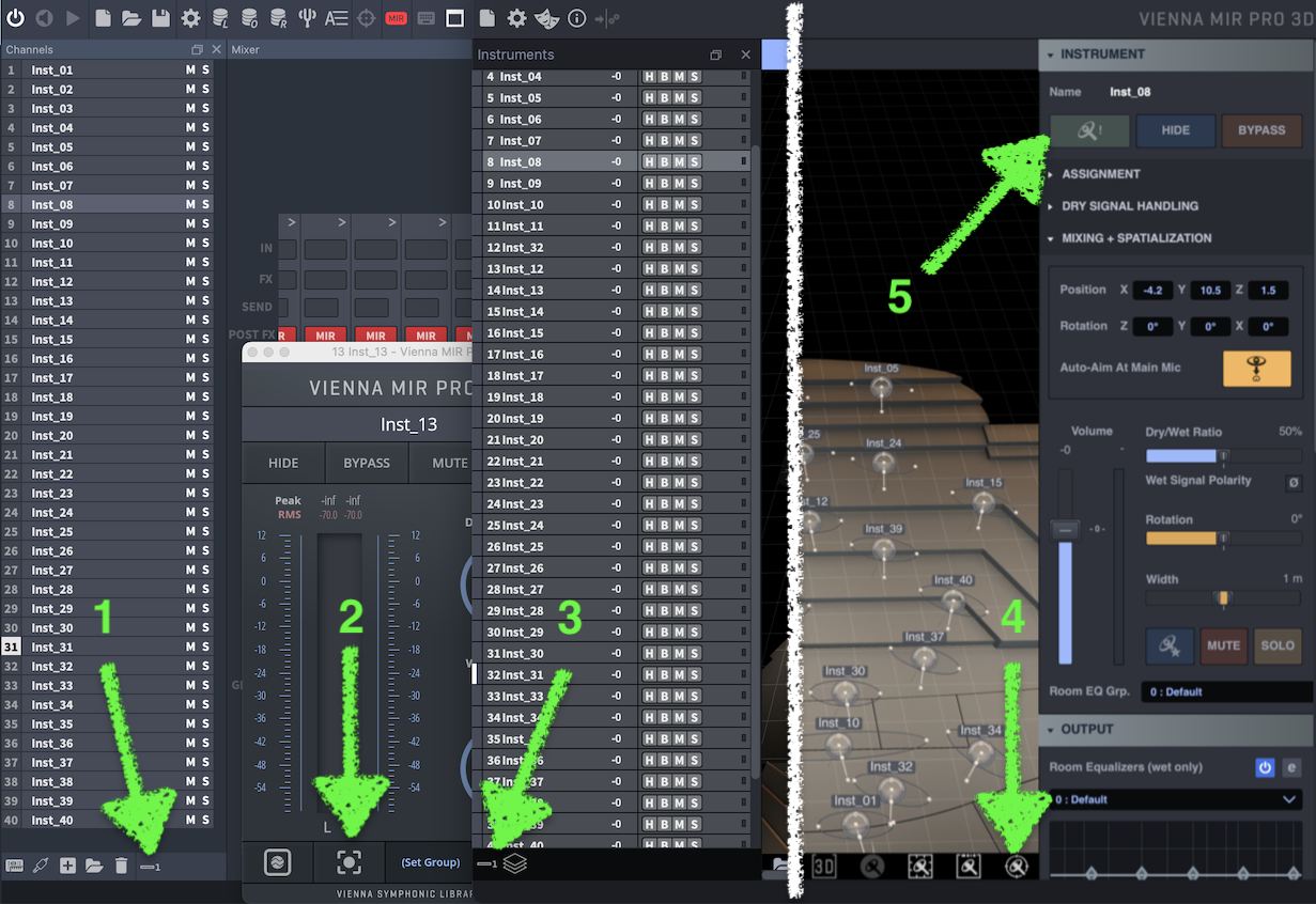
However, the UI is a bit of a mess IMHO. For instance. If I am working in Cubase and would like to change some settings in MIR for a particular instrument, to focus MIR Pro on that instrument (because I actually have over 100 instruments) I must do the following:
Open VEP, select the correct Instance, navigate to the correct channel, click on the MIR Pro plugin to bring up the MIR pro UI, click on the 'Focus' button then open MIR Pro 3D from the task bar. Way too many steps!!
I have tried work arounds with all the features of Bome MTP. But due to the lack of a search field in MIR I am unable to overcome this cumbersome part of my day to day workflow.
A solution might be to allow narrow channel heights on the left side. This would allow more than 12 instruments to be visible at any one time without the need to scroll. Or a search field.
Cheers,


